User Interface Overview
The user interface provides a fully interactive environment for designing, configuring and managing components and the links between them that together define the underlying control system.
User Interface Components
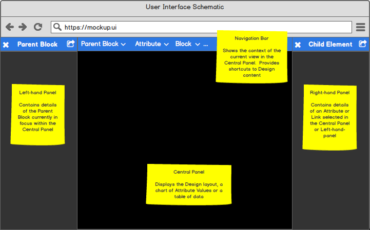
The user interface consists of four core components. The content of each compoent changes dynamically to support the activity you are undertaking:

User interface overview
Looking at each component in more detail:
Component |
Description |
|---|---|
Navigation Bar |
The ‘navigation bar’ at the top of the screen provides the ability to
move through the currently open Design, selecting design elements at
increasingly deep levels of implementation beginning at your selected
|
Left-hand Panel |
The ‘left-hand panel’ provides general information about the
|
Central Panel |
The ‘central panel’ displays information about an Attribute selected
from the Parent Block presented in the ‘left-hand panel’. If Layout
is selected from a |
Right-hand Panel |
The ‘right-hand panel’ provides detailed information about the Block,
Attribute or Link currently in focus. For example, if the ‘left-hand
panel’ represents a |
Principle User Interface views
To support design, configuration and management activies the user interface provides two principle views into the underlying control system:
View |
Content |
|---|---|
Provides an interactive environment for designing and configuring your
control system through |
|
Provides details of a single Attribute, including the ability to view graphical representation of the Attribute’s value within the control system over time. |
Tip
Remember that the location of information, and its nature, will depend on the context in which you are viewing it. In summary:
A Block is always displayed in the left-hand panel. This may represent a Parent Block or a Child Block.
Attribute meta-data is always displayed in the right-hand panel.
Link information is always displayed in the right-hand panel.
Layout View
The Layout View is used to create, modify and manage the overall Design of your control system.
The Layout View is accessed via the ‘View’ or ‘Edit’ button associated
with the ‘Layout’ Attribute on a Parent Block.
Once the layout is displayed individual blocks within it can moved
around the screen by clicking and dragging them to your desired location. Any
links will be dynamically re-routed to accommodate the new location.
Note there is also the ability to automatically optimise the Layout via the
‘Auto Layout’ button within the ‘central panel’.
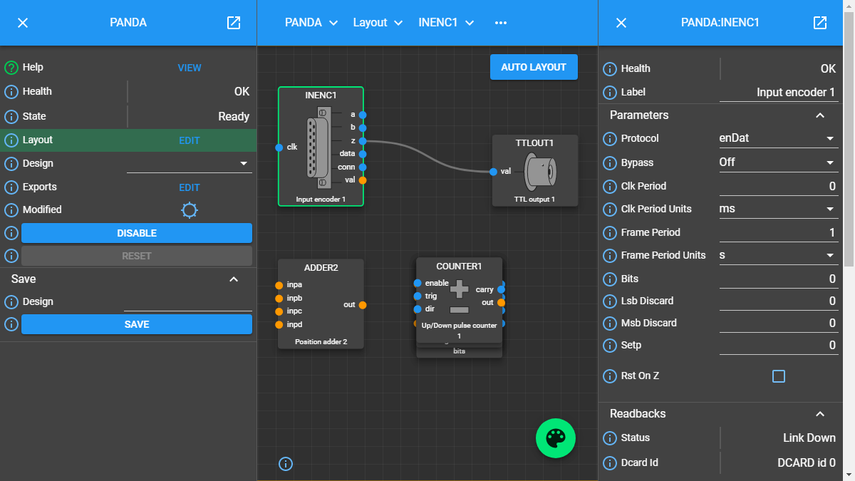
A typical example of the view you may expect to see is shown below.

Example layout
In this example we see:
Summary information about the ‘PANDA’ system displayed in the ‘left-hand panel’.
The Design of the ‘PANDA’ presented in the central
layoutpanel. Note the ‘CLOCKS’blockis highlighted.Detailed information about the ‘CLOCKS’ Block in the ‘right-hand’ panel, including all of its pre-defined
attributes.The ‘navigation bar’ denoting that we are viewing the ‘CLOCKS’ Block via the layout of the ‘PANDA’ System.
Attribute View
The user interface automatically transitions to Attribute View when an Attribute is selected from either the ‘left-hand panel’ or ‘right-hand panel’.
If the Attribute is selected from the ‘left-hand panel’ more detailed information about that Attribute is displayed in the ‘right-hand panel’.
If the Attribute is selected from the ‘right-hand panel’ the
Blockrepresented in the ‘right-hand panel’ is transferred to the ‘left-hand panel’ as the new focus of interest, with more detailed information about the selected Attribute now presented on the right.
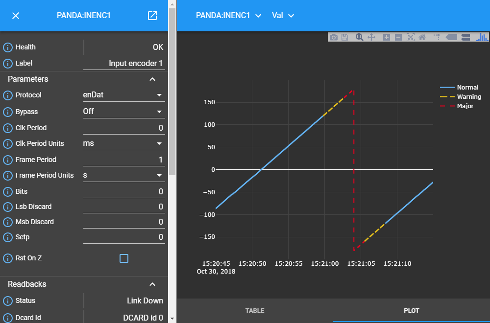
In both cases the ‘central panel’ presents a view of the Attribute’s value against time. This may represent a constantly changing value, for example a calculated data value updated every 2ms, or a periodically changing boolean on/off status indicator that only changes every 10h. Two representations of the Attribute value are available and can be selected by choosing the appropriate option at the bottom of the ‘central panel’ thus:
Plot - presents the Attribute Value as a line chart, displaying value against time. This graphical view is interactive and as a user you have the ability to undertake basic activities within the chart including panning, zooming and exporting for offline use. See Monitoring Attribute Values for further information.
Table - presents the Attribute Value as a series of rows in a table. Each row represents the value at a different time point.
For example, viewing the plot associated with the ‘Val’ Attribute of the ‘PANDA Input Encoder’ Block:

Example plot showing continuously recorded data
Note
Since we are now in ‘Attribute View’ the left-hand panel contains details of the ‘Input Encoder 1’ Block not the ‘PANDA’ Parent Block.
Panel Popping
Under normal use the ‘left-hand panel’ contains summary information about the
current block in focus and the ‘right-hand panel’ detailed information
relating to an attribute or method associated with that Block. In complex
systems it may be desireable to display information about a number of connected
Blocks to track how each updates as data moves through the system they
represent. This can be achieved by ‘popping’ the Block Information Panel via
the icon in the top left-hand corner of the panel. This causes the Block
Information Panel to open in its own independent window. Multiple panels can be
opened in the same way.
Connectivity to the underlying system is maintained meaning each independent window is updated in response to activity within the control system. Similarly, manual updates to any Attribute within an independent Information Panel is reflected back to the control system in the same way as occurs when the Information Panel is integrated with the main user interface. For example:
Example of multiple Block Information Panels popped into an independent display
In this image, which spans two monitor screens, we see three Child Blocks (‘CLOCKS’, ‘COUNTER1’ and ‘BITS’) associated with the ‘PANDA’ Parent Block popped into individual windows and displayed alongside the overall ‘PANDA’ Layout.