A Design is the heart of your system implementation. It is an interactive graphical representation of your system that helps you build and manage:
Blocks representing hardware components, logic gates, etc.
The Link connectivity between blocks, in terms of input (Sink Port) and output (Source Port) ports.
The Attributes associated with blocks and links.
The Methods available to influence behaviour within blocks.
A Design is created in the Web Control Layout view.
Add a block to a design
A block is added to a design by dragging it from the Block Palette into the Layout view:
Select the Palette icon at the bottom of the Layout panel. The Block Palette opens, containing the set of blocks currently available to you.
Identify the block you wish to add. Hovering over it changes the mouse pointer from an arrow to a hand.
Press and hold the left mouse button to select the block, then drag it into the Layout panel.
Release the mouse button at the desired location.
The Block Palette icon is replaced by a full representation of the selected block, showing:
The block name (shown relative to its Parent Block).
An optional, configurable descriptive label (initially default text).
Source Ports that transmit output from the block, including their type.
Sink Ports that receive input to the block, including their type.
After adding a block, select it by hovering over it and clicking the left mouse button. On selection, the Block Information Panel listing every attribute and method available to that block is shown in the right-hand panel.
Remove a block from a design
A block can be removed in one of two ways:
By dragging it to the Bin:
Select the block by hovering over it and clicking the left mouse button. A Bin icon appears at the bottom of the Layout panel.
Holding down the left mouse button, drag the block over the Bin icon. The icon is highlighted.
Release the left mouse button.
By pressing Delete or Backspace:
Select the block by hovering over it and clicking the left mouse button. The selected block is highlighted.
Press the Delete or Backspace key.
Work with the Block Palette
The Block Palette lists each block available to a design, based on the constraints imposed by the underlying hardware.
When a block is selected from the palette for inclusion in a design it is removed from the palette, so it cannot be included more than once. If all blocks of a particular type have been added to a design, no more can be added because the underlying hardware cannot represent them.
If a block is removed from a design it immediately becomes available again in the Block Palette.
Specify block attributes
The behaviour of a block is defined via its Attributes. Attributes are pre-defined based on the function of the block and may carry default values as a starting point for later customisation. A full list of the attributes for each block is given in the documentation for that block.
Types of attribute
Four types of attribute are available; a block may support zero or more depending on its purpose:
| Type | Description |
|---|---|
| Input Attribute | Identifies the source of data received into a block via a Sink Port of the same name. |
| Output Attribute | Identifies the value (or stream of values) transmitted out of a block via a Source Port of the same name. |
| Parameter Attribute | Can be set by a user while configuring a block, influencing the block’s behaviour. |
| Readback Attribute | Set automatically by a process in the execution environment. Cannot be set manually via the UI. |
Attributes whose value can be set at design time are denoted by a highlight below the attribute value field.
Obtain information about an attribute
Select the information icon next to an attribute in the Block Information Panel to open the Attribute Information Panel in the right-hand panel. It displays:
The fully qualified path to the attribute, uniquely identifying it within the design.
Basic metadata: its type, a brief description, and whether it is writeable.
The attribute state, including the severity of any issue and any corresponding message.
Timestamp details showing when the attribute was last updated.
Attribute metadata and alarm-state information is derived from the underlying block specification.
Set a block attribute
Parameter, Input and Output attributes are set via the Block Information Panel of the block you wish to configure. The way an attribute is set reflects its definition in the underlying block specification, and this also hints at whether the attribute is editable. The UI provides four input widgets — View/Edit button, Dropdown list, Text input, and Checkbox.
To configure an attribute:
Select the block by clicking it in the Layout panel. The block is highlighted and its Block Information Panel opens on the right.
Find the attribute you wish to configure.
Edit the attribute value field as appropriate for the widget described above.
While a new value is being submitted, a Processing (spinning) icon is displayed to the left of the modified attribute — see Attribute change lifecycle. On success the icon reverts to the information icon; on failure an Update Error icon is shown.
Export attributes
The UI presents a hierarchical view of the system, with one or more Parent Blocks encapsulating deeper levels of your design. By default, at the top level you see only attributes of parent blocks — but an underlying attribute in a Child Block may influence its parent’s behaviour. Every parent block can therefore Export one or more attributes from its children so they are displayed within the parent.
To specify an attribute for export:
Identify the attribute you wish to monitor outside the current layout level. Note its source, in the form
BlockName.Attribute.In the parent block, select the View option on the Exports attribute.
In the Export Table, select the first blank row (or add a new row).
In the Source column, use the dropdown to find the attribute to export.
In the Export column, enter the name to display when exported. Leave it blank to use the attribute’s default name. User-specified display names must be in
camelCase, e.g. myAttribute.
Once exported, the attribute appears in the Exported Attributes section of the parent’s Block Information Panel. Any number of attributes can be exported from child blocks. Their order mirrors the order in which they were added; to reorder, or to insert above/below an existing entry, use the Insert row above, Insert row below, Move Up and Move Down options in the Export Table.
To remove an exported attribute, open the parent’s Export attribute, select the information icon for the relevant row, and choose Delete on the Delete row field.
To apply your changes, select Submit at the bottom of the Export Table, then refresh the parent block to confirm the attributes have been promoted (or removed). Select Discard Changes at any time to abandon edits without affecting the recorded specification.
Local vs. server attribute state
The physical hardware is configured from the design specification behind the graphical representation. A change takes effect in hardware only when it is submitted and recorded. It is therefore important to understand the difference between local and server attribute state, particularly for Parameter Attributes that can be modified directly in the UI.
Local state is a parameter attribute that has been modified in the UI but not yet submitted. It has no effect on hardware. Locally modified attributes show the edit icon next to the attribute name. An attribute enters local state as soon as its value is changed and remains there until Enter is pressed to submit. If the server reports an error, the attribute stays in local state until the issue is resolved.
Server state means the value has been recorded to the information server hosting the design specification. Server-state attributes are reflected in hardware and show the information icon.
Attribute change lifecycle
Recording a modified attribute value is referred to as a put action. Once the put completes, the value takes immediate effect on any executing processes. If an error is detected during the put it is abandoned and reported back to the UI.
The round trip from submission to use takes a small but non-deterministic time while data is transferred, validated and recorded, so attribute modification is not atomic. During this time the Processing (spinning) icon replaces the information icon; its reversion is the only reliable indication that the value has been recorded and is now in use.

Attribute change lifecycle workflow
Complex attributes
An attribute may itself represent a collection of values that together define the overall attribute. For example, the Sequencer block contains a single attribute defining the sequence of steps performed by hardware when controlling motor motion.
These values are presented as an Attribute Table, generated dynamically from the attribute’s specification within its block. For details of a specific table, refer to the technical documentation of its block.
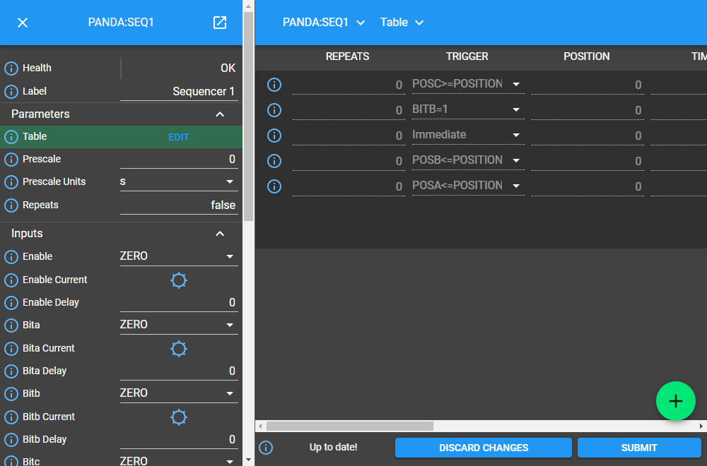
Example Attribute Table associated with a complex attribute
Identify table attributes
A table attribute is identified by the View/Edit button associated with it. Selecting the button opens the Attribute Table in the central panel.
Specify attribute table content
On opening an Attribute Table you can define values, which (like attributes themselves) may be selected from a list, enable/disable options, or text and numerical inputs. After adding values, select Submit at the bottom of the table to record them, or Discard Changes to abandon edits.
Static vs. dynamic attribute tables
Static tables have a fixed number of columns and rows; all fields must be completed to fully define the attribute.
Dynamic tables have a fixed number of columns but a varying number of rows. At least one row must be present.
New rows are added in one of two ways:
Select Add below the last row to append a new row.
If row order matters (for example, a sequence of activities), select the edit icon on an existing row (or the information icon on a new row) and use Insert row above, Insert row below, Move Up or Move Down.
To remove a row, select the information icon on the row and choose Delete on the Delete row field.
Work with block methods
While Attributes define a block’s behaviour, Methods define the actions it can perform. A method is represented as a button labelled with the action it performs, executed only when the button is pressed.
There is currently a single method: Save on the Parent Block, which requires the name of the file to save the design to as its input parameter. Method parameters:
Can be edited directly in the Block Information Panel.
Exist in local state until the method’s button is pressed.
Are properties of their method rather than entities in their own right; they are never recorded on the server or saved in the persistent design.
Obtain information about method execution
Selecting the information icon on a method displays two sources of information:
The right-hand panel describes the method’s purpose and required parameters.
The central panel shows a log of each method execution in the current session, including submission and completion times, the completion status (e.g. success or failure), and any alarms. Selecting a parameter name in the table header opens information about that parameter in the right-hand panel.
Block ports
Blocks may receive input via one or more Sink Ports and transmit output via one or more Source Ports. A block’s ports are listed in its documentation. Ports are colour-coded by the type of information they carry:
| Port type | Key |
|---|---|
| Boolean | Blue |
| Int32 | Orange |
Information is transferred from a source port to a sink port via a Link — see Linking blocks below.
Link blocks
Blocks are connected via Links. A link joins a Source Port on one block to a Sink Port on another; both ports must be of the same type. A block’s ports and their specification are defined in its documentation.
Create a block link
Hover over the Source Port or Sink Port at one terminus of the link. The port is temporarily highlighted.
Press and hold the left mouse button and drag the link to the port at the other terminus. The target port is temporarily highlighted.
Release the mouse button. If the link constraints below are respected, the link is displayed in the Layout.
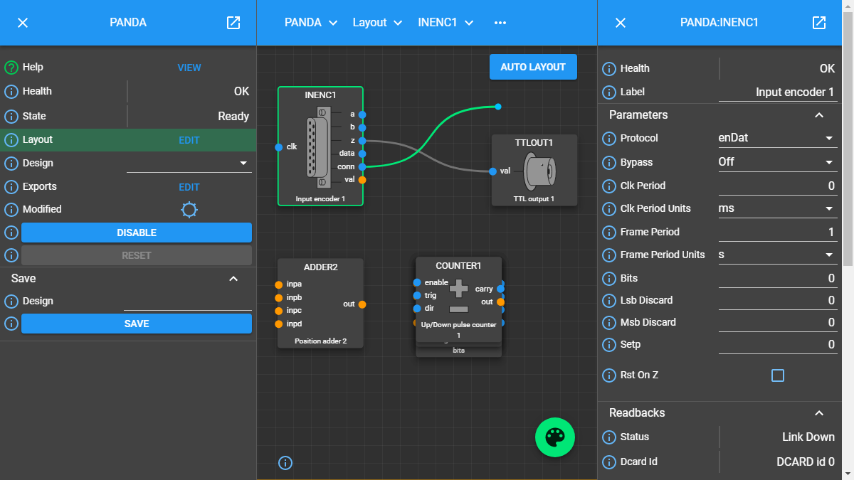
Creating a link between two blocks
Interrogate link attributes
A link has no attributes of its own, but selecting it shows information about its Source Port origin and Sink Port target in the right-hand panel:
Hover over the link. It changes colour to denote it may be selected.
Click the left mouse button. The Link Information Panel opens on the right.
Remove a link
By pressing Delete or Backspace: hover over the link, click to select it, then press Delete or Backspace.
Via the Link Information Panel: select the link, then choose Delete in the Link Information Panel.
Constraints when using links
A Sink Port can accept only a single link.
Multiple links can originate from a Source Port, connecting it to multiple blocks.
Links can connect only a Source Port and Sink Port of the same logical type (e.g. boolean, int32). Port types are colour-coded in the Layout to aid identification.